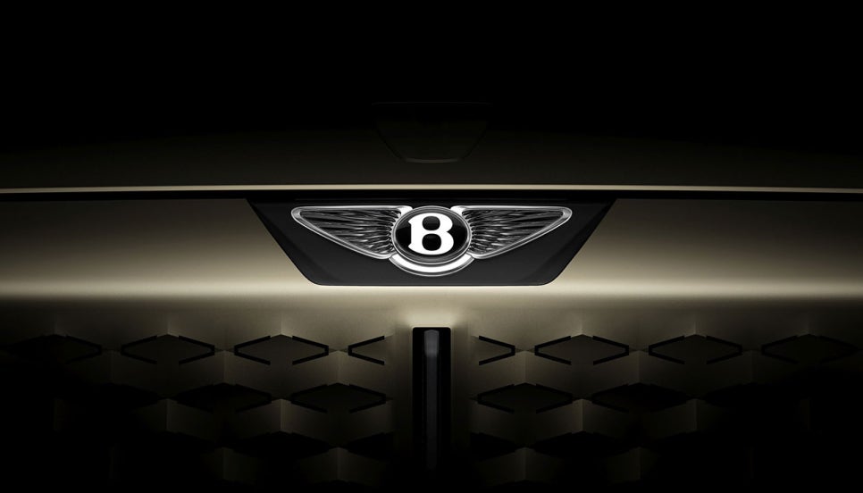
bentley has officially unveiled its fifth FlyingB logo for the digital age, with the biggest change being the perfect symmetry in the number of feathers on each wing, which is being hailed as a blend of Bentley’s traditional identity and modern minimalist design.
trends in logo changes for automotive brands
- in recent years, major brands such as Volkswagen, BMW, and Mercedes-Benz have changed their logos to reduce three-dimensionality and complexity in favor of 2D-minimalist designs
- peugeot joined the trend by keeping the complexity but removing the three-dimensionality
- bentley follows suit with a new logo to keep up with the times
the evolution and characteristics of the Bentley Flying B logo
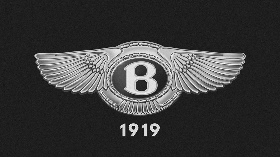
- emphasizes brand heritage, remaining largely unchanged in the 106 years since its first design in 1919
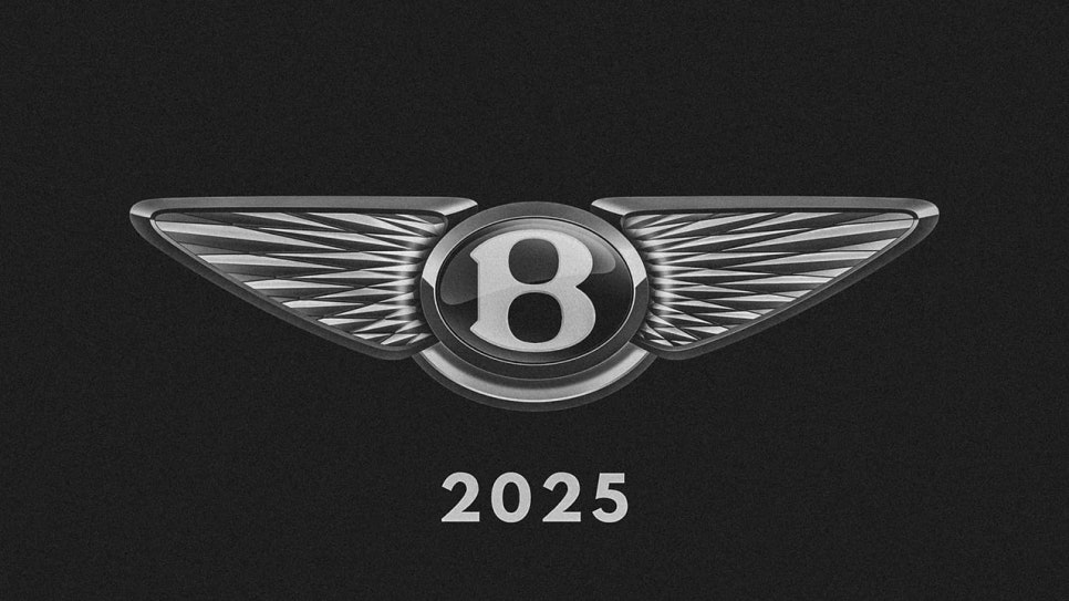
- this fifth-generation logo retains the center oval and Blogo, but drops the peripheral embellishments (tail feathers, etc.)
- the wings are modernized with a diamond pattern andjewel-like cutouts instead of realistic feathers
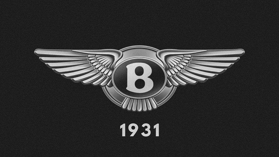
- biggest change: the number of feathers on both wings is perfectly symmetrical (early: 13 left, 14 right → 1930s: 10 left, 11 right → new: same left and right)
the number of feathers in the Bentley logo, what it means and how it’s changed
- the historical asymmetry (different number of feathers on the left and right) has many theories, including anti-counterfeiting and good luck symbolism
- some race cars and specialty models (such as the Continental GT) still retain the 1930s scheme
- new logo features a diamond pattern so elaborate that it would have taken counting feathers tocreate it
when it goes live and first cars
- exact timing of the new logo is TBD
- july 7, 2025, will be the official unveiling of the first new car with the new logo
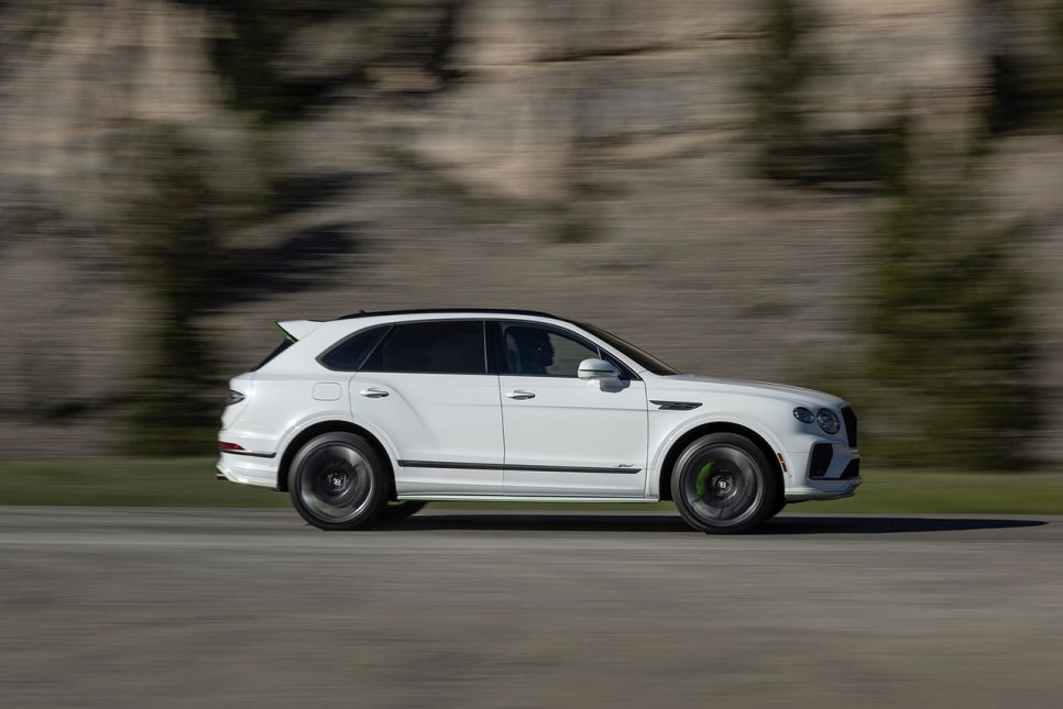
- the first vehicle is likely to be the Bentayga follow-up fully electric SUV concept
industry and Fan Reaction
- mostly favorable, with many praising the car’s ability to blend Bentley’s heritage with modern sensibilities
- emphasis on identity inheritance and refined evolutionrather than radical change
bottom line
bentley’s fifth Flying B logo is a design that reflects the brand’s heritage while embracing modern minimalism, featuring symmetryin the number of feathers on each wingand an intricate diamondpattern. with the unveiling of its first new product (an electrified SUV concept car) on July 7, automotive fans around the world are focused on Bentley’s future strategy and design direction.



📝 리뷰 작성하기